Monzo - UI Promo
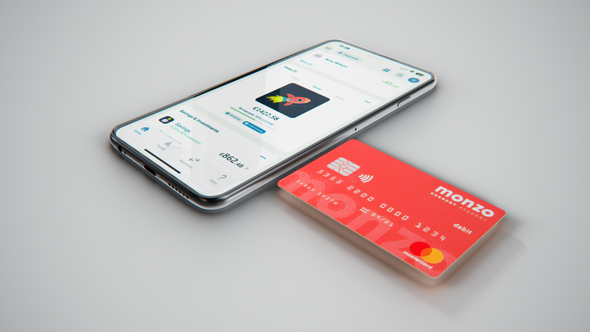
This self-initiated project was developed as a conceptual exploration of Monzo’s Pots feature, using both 2D and 3D animation to experiment with how motion design can communicate digital product usability. By framing the experience within a mobile device, the piece highlights the clarity of navigation and the intuitive qualities of the interface. The animation approach was deliberately dynamic and transformative, aiming to capture a sense of fluidity and seamless interaction while also serving as a study in how motion can enhance user experience storytelling.
Software: Adobe After Effects / Adobe Illustrator / Cinema 4D
I recreated three of Monzo’s core app icons in Illustrator and animated them in After Effects. The intention was to establish a motion style that was both fluid and purposeful, with seamless transitions between icons designed to create an engaging, playful interaction. Through this, I explored how animation can elevate usability and add character to the overall experience of using Monzo’s digital products.
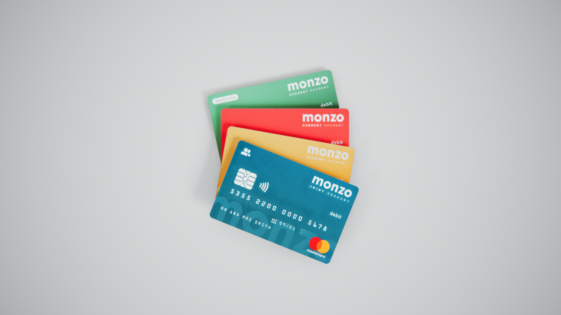
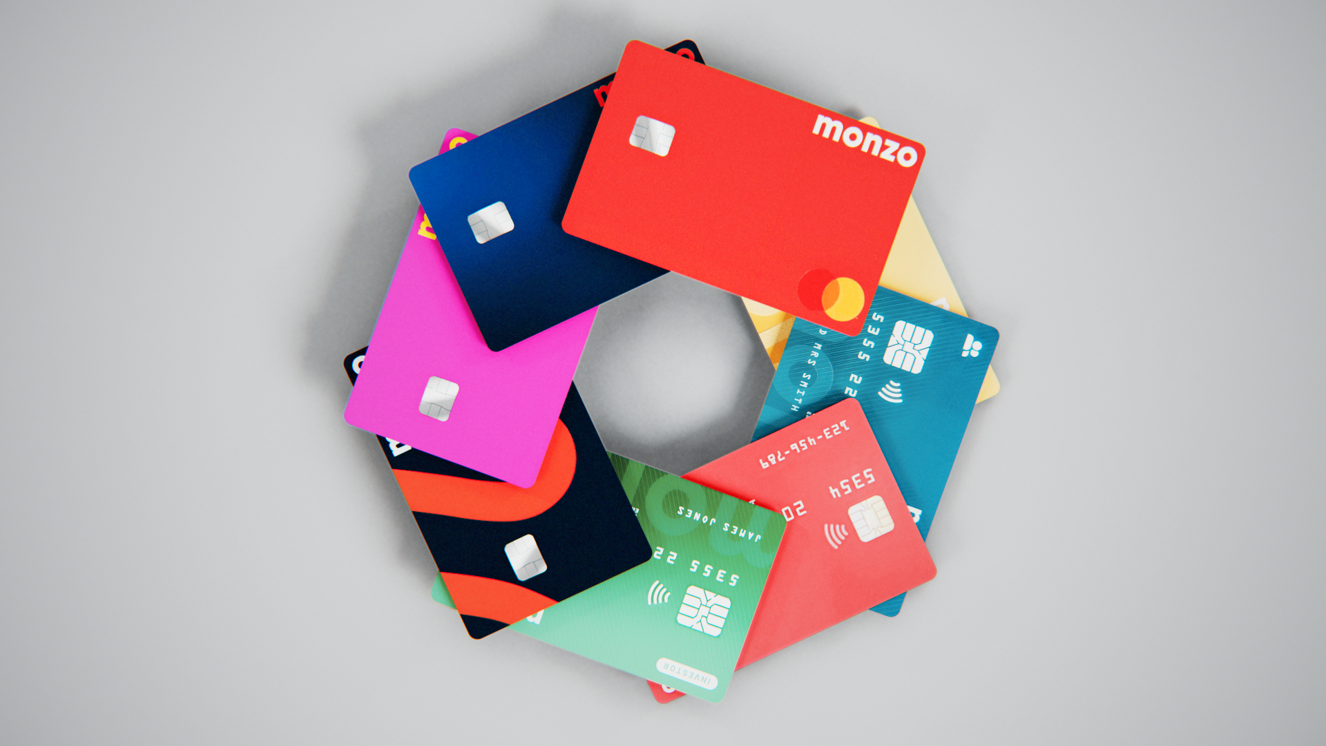
To create the visual assets, I built a set of Monzo-inspired bank cards in Cinema 4D, applying branded textures to ensure consistency and realism. The card assets were designed to emerge and transform out of the logo, reinforcing the fluid, dynamic style established throughout the project. In addition, I experimented with multiple texture variations, exploring different finishes and colour treatments to see how the cards could be rendered with a more refined and realistic aesthetic.